
The Brand
In this section, we delve into the essence of our brand, the values and principles that define who we are and how we present ourselves to the world. Discover the audience we connect with, the position we hold in the market, and the personality that sets us apart.
Brand Guidelines Overview
Monkey Minds is smart, sharp and human — like the best conversation you had at a conference, except it's on a website. Most agencies are either fun but fluffy or serious but boring. We sit in neither camp: the playfulness earns attention, the directness earns trust. That combination is rare, and it's exactly what these guidelines exist to protect across every touchpoint — from the logo and colour palette to how we write and speak.
Brand Positioning
Our brand shows up through four traits. Fun & Playful — unexpected moments of delight, cheeky copy, bold visuals; the monkey metaphor gives us permission to be irreverent without being unprofessional. Colourful & Bold — big type and strong hierarchy that make a statement before anyone reads a word, colour used with confidence, nothing timid or muted. Honest & Direct — no agency waffle, copy that sounds like a person not a brochure, speaking to CEOs and CMOs as equals. Smart & Witty — humour from insight rather than effort; sharp without being cold, confident without being arrogant.
Tone Of Voice
We write with four principles. Witty but earned: humour comes from insight, not effort — if it feels like we're trying to be funny, we cut it. Short and confident: one idea per sentence, no run-ons, no qualifiers — we say the thing. Outcome-first: CEOs want results, CMOs want performance, so we lead with what changes for them. Honest over impressive: we don't oversell or undersell, we let the work speak. Before publishing anything, we ask: could a 12-year-old understand it, would Pau actually say this out loud, and does it tell the reader what's in it for them? If any answer is no, we rewrite.
Logo
In this section you'll discover the backstory of our logo's creation, the symbolism embedded in its design, and the guidelines ensuring its consistent and effective usage across platforms.
The logo
The logo contains a sleek and sophisticated wordmark, embodying our commitment to clarity and professionalism in all endeavors. The logo symbol resembles the letter "B," an homage to our name and story. This symbol evokes the imagery of a signal, like a radar emitting waves of possibility and discovery.
Construction and safe space
Rooted in a commitment to clarity and coherence, every aspect of the logo was carefully considered and meticulously aligned within a grid and spacing system.
Construction
Safe Space
Logo usage
The logo may be used in several ways and it different color variants. The flexibility of the logo system allows for easy usage and impact across all platforms.
Primary Logo
Secondary Logo
Secondary Logo
The secondary logo used on a dark blue backgrounds.
Logo Symbol

Downloads
Typography
Typography is one of the cornerstones of our visual identity. A good pairing of fonts and a strong hierarchy ensure maximal visual impact. Beneath you will find information about the typefaces we use.
Primary Typeface
Aspekta is a modern sans-serif collection inspired by a clean, simple and neutral style.The family provides a wide range of weights and stylistic alternatives that can be mixed to create strong branding. Aspekta is used for headings.
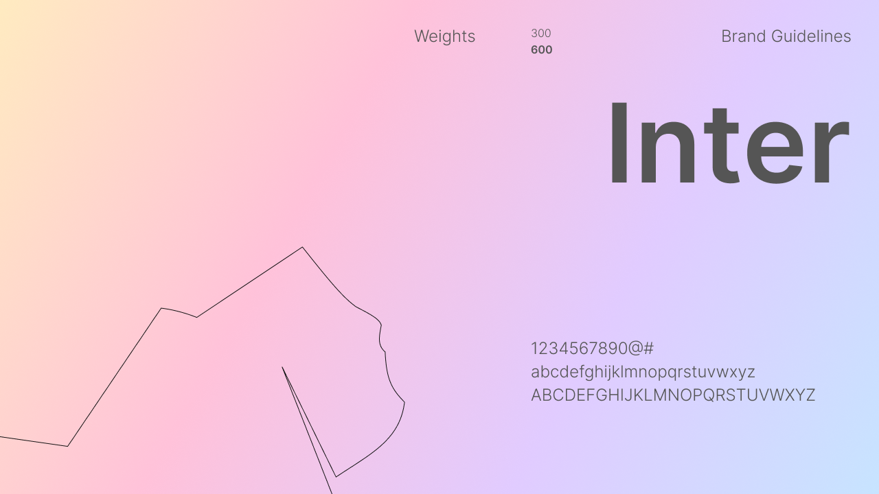
Secondary Typeface
Inter is a typeface carefully crafted & designed for computer screens. Inter features a tall x-height to aid in readability of mixed-case and lower-case text. Inter is used for all paragraphs and body texts as well as subheadings etc.
Colors
The colors are another essential part of of our visual identity across all platforms. In the following section you will find the primary colors as well as an extended palleted to be used for web.
Primary Colors
The primary color palette consists of 3 supporting colors and one brand color. These colors are used in our logos, on flyers and on social media etc.
Color Palette For Web
When designing for the web a more nuanced and extensive color palette is defined to give the freedom to create a more nuanced design while still operating within the boundaries of our visual identity. More accent colors will be added to this section.