Bold vs Safe: Why Playing It Safe With Your Brand Online Is the Biggest Risk
The hidden cost of 'safe' design choices: generic palettes, stock photos, vague copy. A strategic case for distinctive brand expression, backed by evidence.
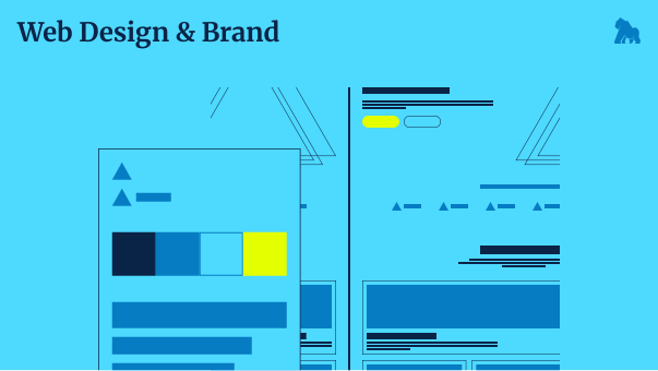
There's a sea of blue SaaS websites. Soft gradients, sans-serif fonts, stock photos of diverse teams in open-plan offices. Clean. Inoffensive. Interchangeable.
They all played it safe. And in doing so, they all disappeared.
This is the paradox of cautious design: what feels like the risk-free choice is, commercially, one of the riskiest things a brand can do.
What "Safe" Actually Looks Like
Safe design choices aren't random. They come from a very understandable place:
- "We don't want to alienate anyone"
- "We want to look professional and credible"
- "Let's see what our competitors are doing and do something similar"
The result is a website that could belong to almost any company in your category. A palette of navy, white, and a single accent colour. A hero section with a bold headline that sounds like a mission statement. A services page that lists what you do without explaining why it matters.
It's not ugly. It's worse than ugly. It's forgettable.
The Commercial Cost of Being Forgettable
Memory is how purchasing decisions get made. When a CMO or founder eventually needs the service you offer, they'll reach for the brand they can recall most easily — and the one that made the strongest impression.
Bland, generic design makes no impression. It's processed and discarded without leaving a trace.
Research from Nielsen Norman Group consistently shows that users spend the majority of their time on other websites before visiting yours. They have a reference point for what's standard. What's standard is ignored. What's different gets remembered.
The brands that win attention in crowded markets are almost never the ones that looked most like their competitors. They're the ones that had the courage to look like themselves.
"But We Need to Look Professional"
This is the most common pushback — and it's based on a false dichotomy.
Professionalism and distinctiveness are not in tension. In fact, a well-crafted, deliberately distinctive brand often reads as more professional than a generic one, because it signals intentionality. Someone made decisions here. This didn't happen by default.
The companies that look generic often do so precisely because no one made a real decision. They took the template, chose the safe colours, wrote the expected copy. The result feels like no one was really in charge of the brand.
Boldness, done with strategic intent, communicates confidence. And confidence is what prospects are looking for when they're deciding who to trust with their budget.
What Bold Actually Means
Bold doesn't mean loud. It doesn't mean neon colours, aggressive typography, or design that prioritises shock over usability.
Bold means clear point of view. It means a brand that has decided who it's for and committed to speaking directly to that person. It means a visual identity that is genuinely distinctive within its category, not just a variation on the category standard.
Some of the boldest brand choices are actually quite restrained — minimal palettes, considered typography, confident white space. What makes them bold is the intentionality. They didn't happen by accident.
The Competitive Dynamic to Understand
Here's the market reality: most of your competitors are playing it safe. Their websites look similar. Their messaging sounds similar. Their offers feel similar.
That creates an extraordinary opportunity for any business willing to show up differently.
In markets where everyone looks the same, being distinctly and authentically yourself is a competitive advantage. You become the brand that prospects remember when they're ready to buy. The one they mention to colleagues. The one that seems, somehow, a cut above — even if the underlying service is comparable.
This isn't about being weird for the sake of it. It's about recognising that bland is the baseline and moving confidently away from it.
The Questions Worth Asking
Before your next brand or design decision, consider:
- If we removed the logo and company name, could this content/design belong to any competitor?
- What do we genuinely believe that our competitors don't say out loud?
- What visual or verbal choices would communicate exactly who we are — not who we think clients want us to be?
- Are we choosing this because it's right for us, or because it feels safe?
Honest answers to these questions will tell you more about your brand's strategic positioning than most brand exercises.
Risk, Redefined
The business that plays it safe with its brand thinks it's minimising risk. In reality, it's accepting a different, quieter kind of risk: the risk of never being remembered, never being chosen, never standing out enough to matter.
In a world of infinite choice and shrinking attention spans, invisibility is the existential threat. Bold isn't dangerous. Forgettable is.